Role: Visual and UI Designer, and User Tester
Duration: Feb - Mar 2023
Team: 4 Designers
Tools: Adobe XD, Illustrator, and Photoshop
Problem Statement
We noticed a need for a few things to be improved upon in the music app industry. Music applications currently on the market do not allow users to choose their genre and artist preferences while also giving them the chance to select their mood all in one app. Current music apps tend to overwhelm users by presenting too many options at once, leaving them confused and frustrated. While current music apps connect with navigation apps like Waze, they do not allow you to fully access your music app while driving. They also do not offer hands-free capabilities.
Project Vision
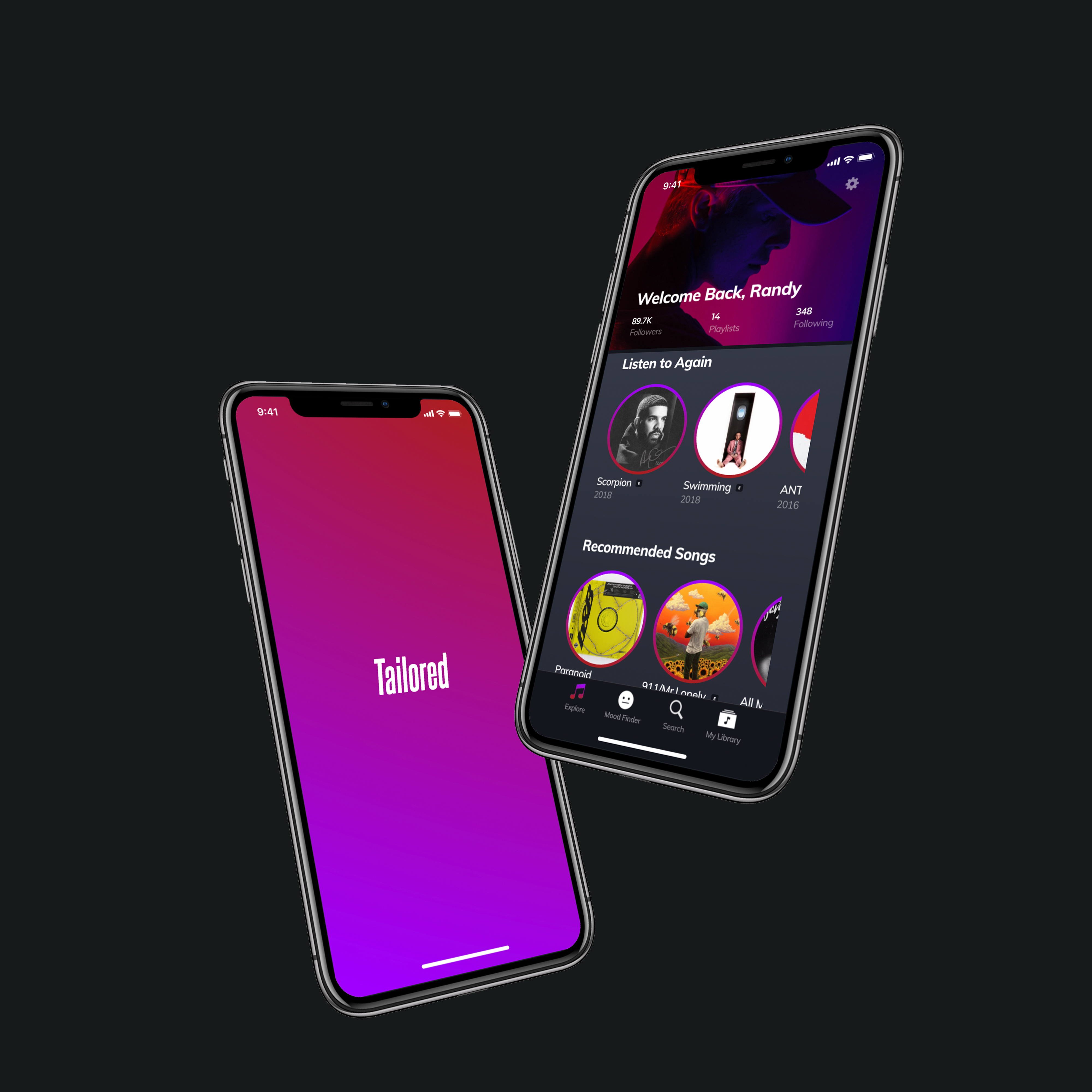
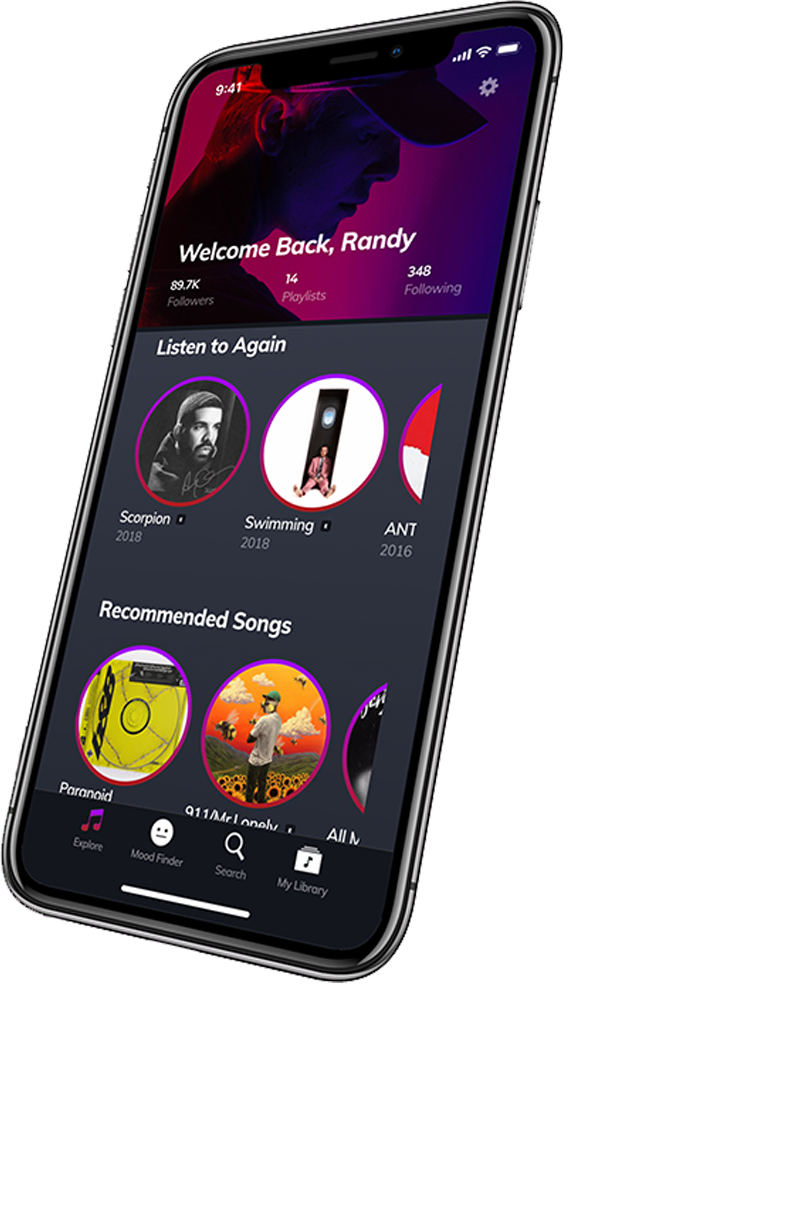
Our team wants to develop an app customizes music to the user's mood and other preferences. Our app will focus on simplifying the home/explore page to avoid overwhelming the user. We will rely on chunking to categorize and separate the options presented to users at at a time. We will allow users to fully access the application while also using the navigation feature. Our navigation feature will provide users with hands-free music and direction capabilities.
Goal Directed Design
Goal-Directed Design is a process of design that was created by Alan Cooper. Unlike other design processes, Goal-Directed Design focuses on the needs of the user. Following the steps in the design process, my team and I were able to create a successful prototype for an app.
The steps to this design process are:
1. Research
2. Modeling
3. Requirements
4. Framework
5. Refinement
6. Support
Research
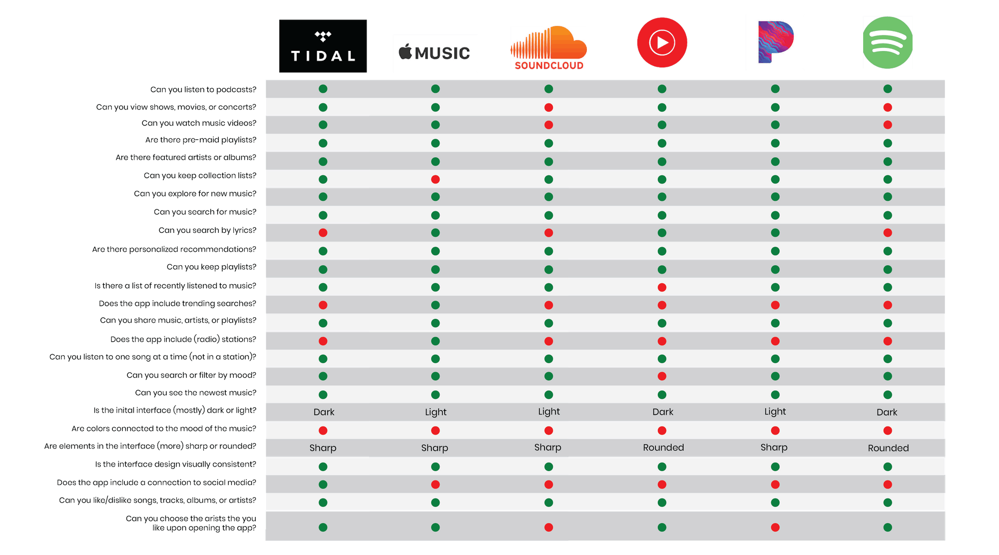
First, our team began our brainstorming process. We began brainstorming together at our first team meeting. Once we had some ideas down about what exactly we envisioned for this app, we began our competitive audit. This is how we compared popular existing music apps to see what our app would be competing with. When comparing these apps, our team noticed a need for a few things to be improved upon in the music app industry. The first issue we noticed was that while yes many music apps on the market provide users with new music ,they do not allow users to choose traditional preferences while also giving them the chance to select their mood all in one app. When thinking about our driving mode feature we discussed Spotify. It does connect with Waze but, it does not allow you to fully use Spotify while driving and on top of that is not hands-free. We decided to include a microphone feature for a hands-free driving experience. Another issue that we discovered was the amount of clutter on other apps' explore/home page. In our opinion these pages were unorganized and showed users too much content at once. From this finding, we decided to simplify the home/explore page in order to avoid overwhelming the user.
Personas
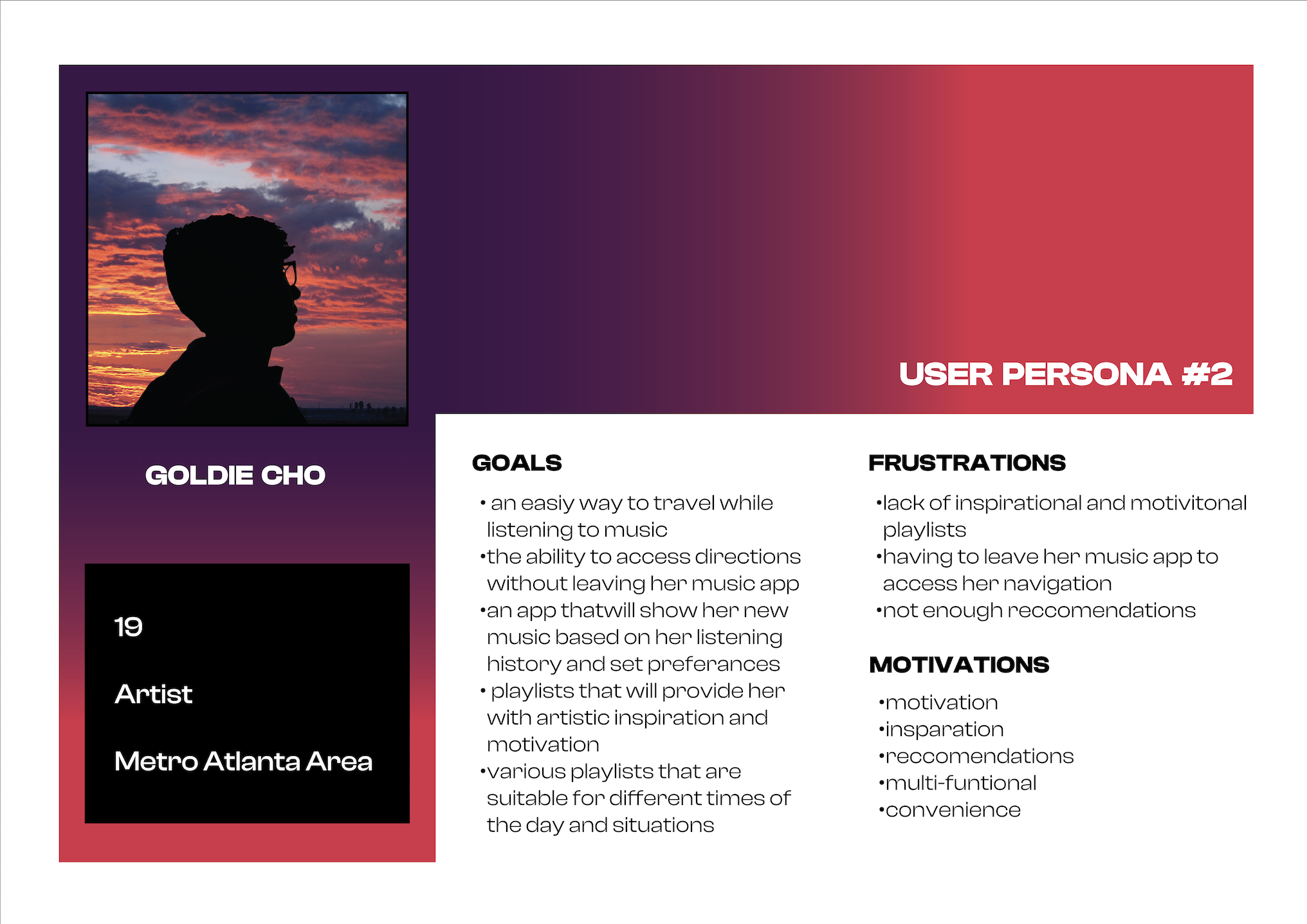
After we completed our competitive audit and a few other steps in the early parts of the design process we began to discuss who would use this mobile app and what our personas would be. As a team, we created our primary and secondary personas.
Wireframing
Paper Wireframe
With our preliminary work complete, it was time to start designing. Our team decided to each sketch our wireframes separately. We then compared all of our individual wireframes and selected the layout and components that we wanted for our app.

Low Fidelity Wireframe
As a group, we each took on pages that we wanted to begin working on. I started with our loading, signing in, creating accounts, genre, artist selection, and exploring pages. Our team then met again to refine all of the pages. We created our wireframes on Whimsical. After we met, I created a page for each persona so that when we began prototyping we would be able to test using two different users.

High Fidelity Wireframe
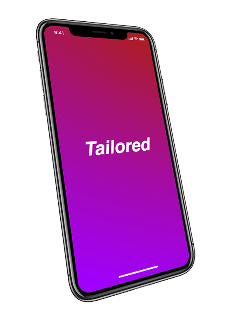
With our layout complete, we began designing our high-fidelity in Adobe XD. Our team wanted to keep our design simple to avoid overwhelming the user. We also decided to design with a modern and clean aesthetic along with pops of color.

Style Guide
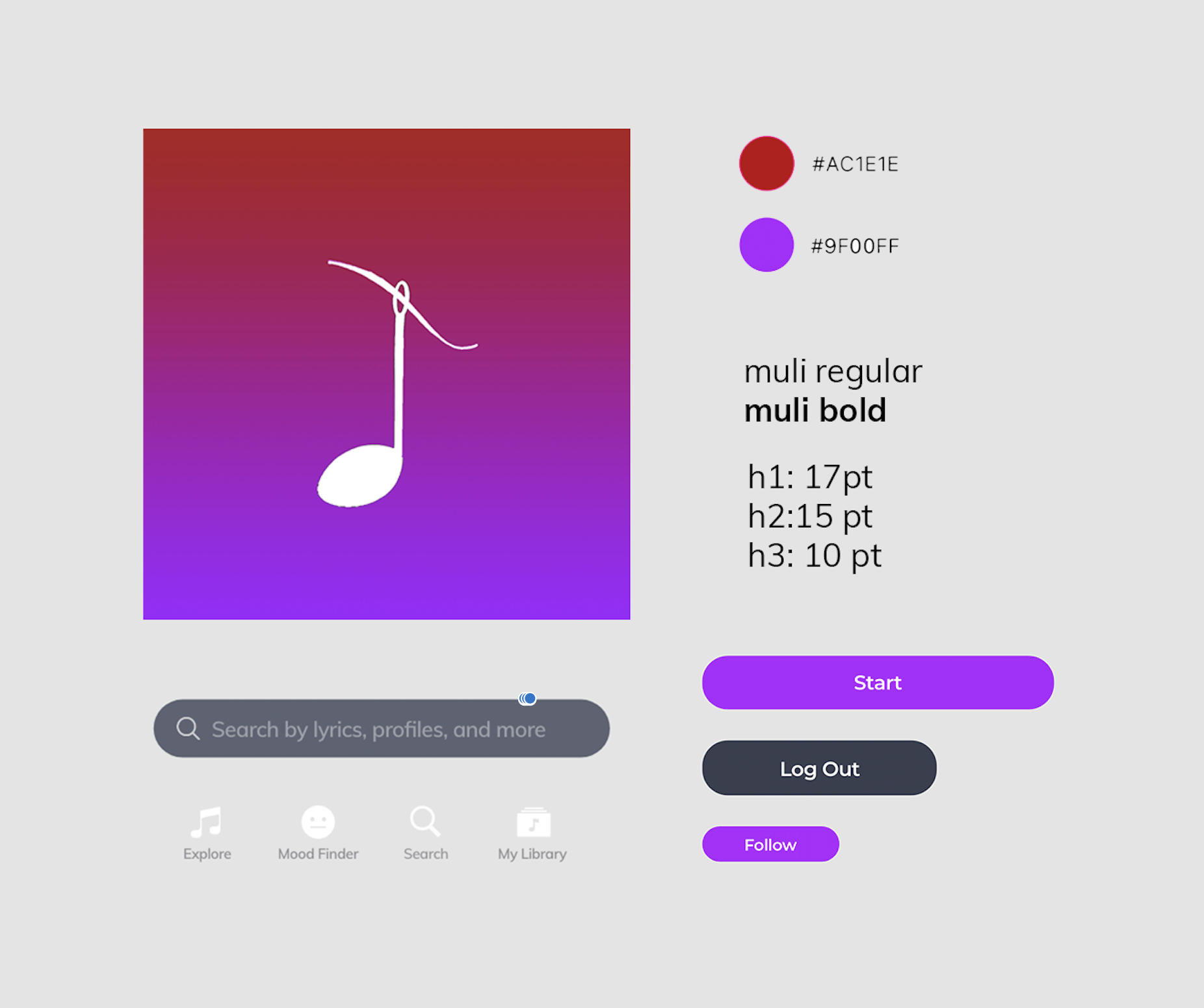
Our team wanted our app to have a modern feeling while also looking clean. We decided to choose two accent colors to compliment our logo and use throughout the site. Our primary colors were shades of grey and white. We thought having a dark background would add to the modern feeling while also adding contrast. In order to simplify our design we only selected one font, Muli. We decided on button styles and sizing for different features. Our team also finalized our icon selection.
Final Product
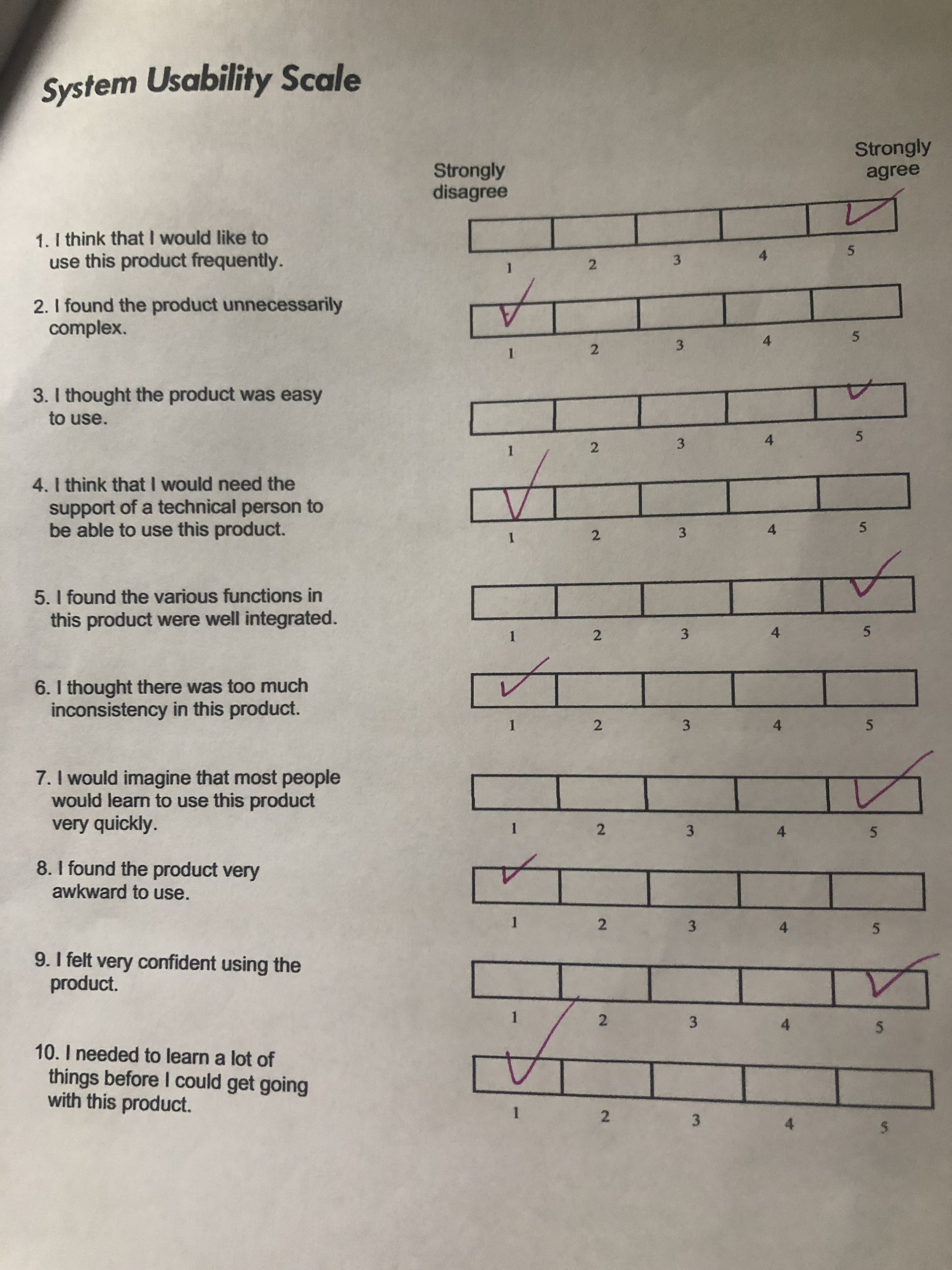
Finally, our prototype was done after a few design changes and it was time for us to get some feedback. We conducted user testing with seven people. Overall we got back great feedback. The main issues people came across were that the color feature was difficult to find, and at times it was hard for the user to scroll. We then took this feedback and incorporated it when we went back to make edits to the initial prototype. WIth our edits, we determined that our app was usable through calculating all of our user's System Usability Scale forms. Below is a screen recording of one of our testing subjects using the app to enter Driving Mode. I also included a copy of one of the System Usability Scale forms for reference.
Final Thoughts
After three months of hard work, we finished our project after a few last-minute. This project was a favorite to work on and I am proud of how it turned it. This project allowed me to fine tune preexisting skills while also forcing me to challenge myself and take on new skills. I am now more confident in my XD skills and became familiar with a new platform, Protopie. Please contact me with any questions using the information provided.
