
Role: UI Designer, Researcher, and User Tester
Duration: Aug - Nov 2020
Team: 4 Designers
Tools: Figma, Illustrator, and Photoshop
Problem Statement
The current state of Twitter is relatively broad. Many users engage with a multitude of different discussions and topics, some of which trend every other day. Because of all of. these topics being discussed, many users find themselves being bombarded with lots of opinions. This causes users to create group chats specifically related to their interests so that they can engage with other like minded individuals about the topics they enjoy, free of outside opinions.
Project Vision
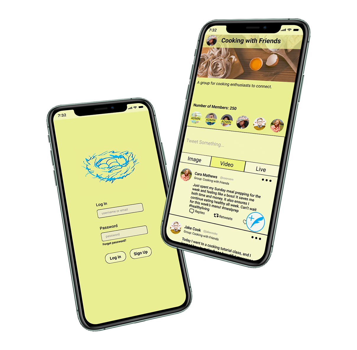
Our app would like to bring forth the idea of groups, or communities, to twitter in order to provide its users with the ability to create safe spaces to discuss their favorite topics. These groups may be created by anyone who has an existing Twitter account. Inside of these groups, the users will have the opportunity to set up guidelines and rules to encourage safety and respect, as well as fun discussion boards where users may voice their opinions without having to worry about others unsolicited thoughts.
Lean UX
Lean UX is a process of design that is more fast-paced and focuses on the minimum viable product. Lean UX combines Agile, Lean, and Interaction Design into one process. In Lean UX we meet more frequently and divide our work into sprints.
- Form and test assumptions and create a hypothesis, with outcomes
- Wire-framing and user testing
- Minimum Viable Product
- Prototyping and user testing
Assumptions
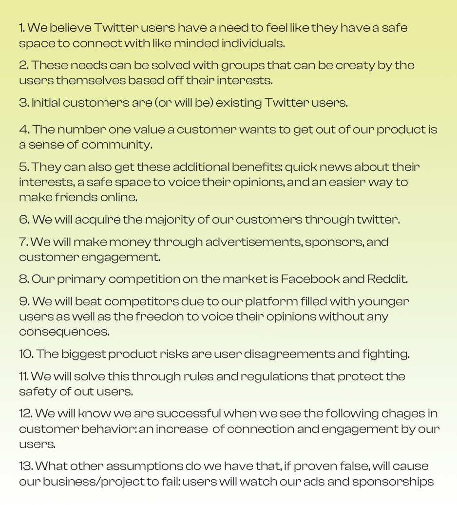
Business Assumptions

User Assumptions

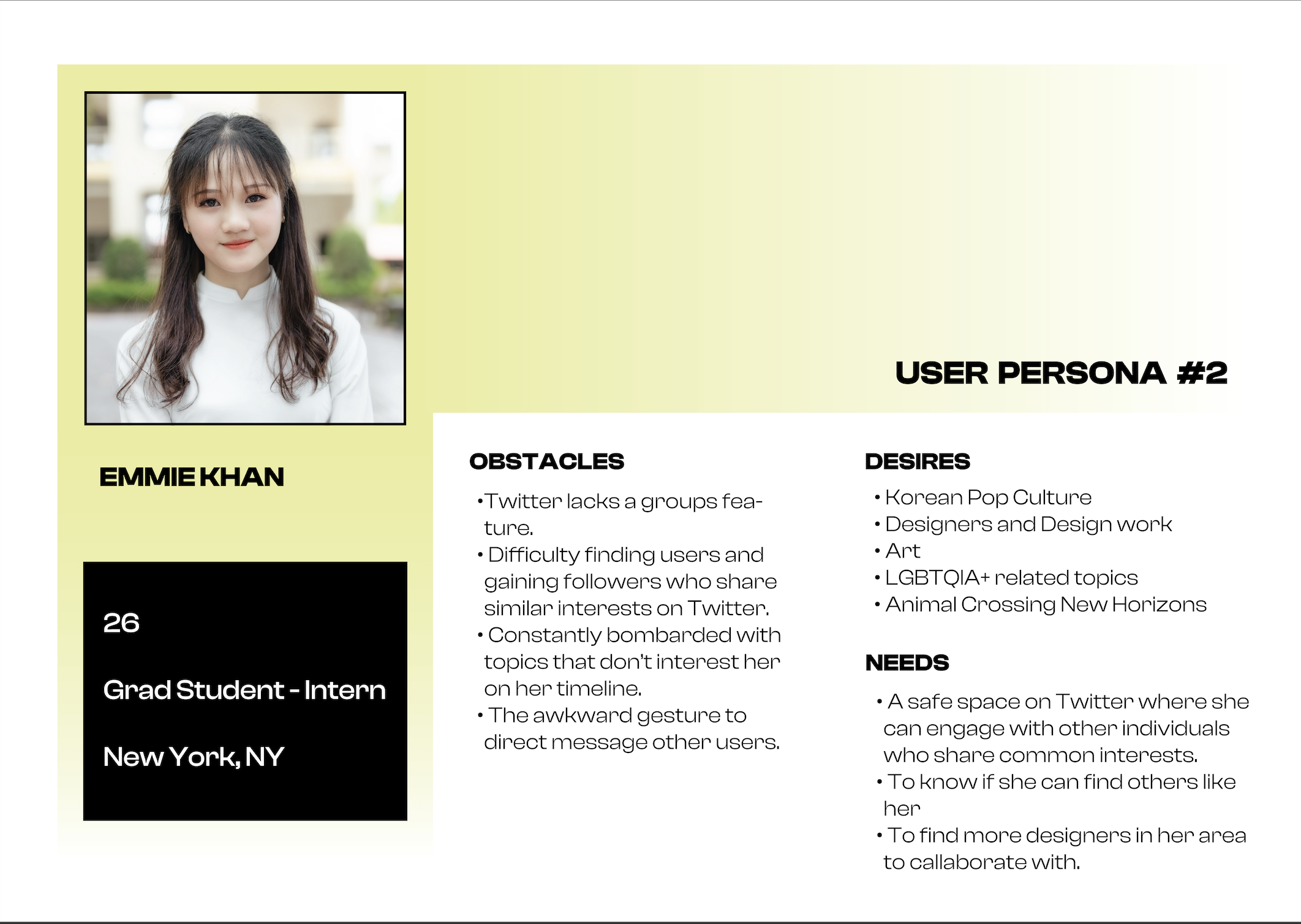
Personas
After we completed our competitive audit and a few other steps in the early parts of the design process we began to discuss who would use this mobile app and what our personas would be. As a team, we created our primary and secondary personas.
Wireframing
Low Fidelity Wireframe
As a group, we each took on pages that we wanted to begin working on. I started with our loading, signing in, creating accounts, genre, artist selection, and exploring pages. Our team then met again to refine all of the pages. We created our wireframes on Whimsical. After we met, I created a page for each persona so that when we began prototyping we would be able to test using two different users.

High Fidelity Wireframe
With our layout complete, we began designing our high-fidelity in Adobe XD. Our team wanted to keep our design simple to avoid overwhelming the user. We also decided to design with a modern and clean aesthetic along with pops of color.

Style Guide
Our team wanted our app to have a modern feeling while also looking clean. We decided to choose two accent colors to compliment our logo and use throughout the site. Our primary colors were shades of grey and white. We thought having a dark background would add to the modern feeling while also adding contrast. In order to simplify our design we only selected one font, Muli. We decided on button styles and sizing for different features. Our team also finalized our icon selection.

Final Product
 View Prototype
Final Thoughts
After three months of hard work, we finished our project after a few last-minute. This project was a favorite to work on and I am proud of how it turned it. This project allowed me to fine tune preexisting skills while also forcing me to challenge myself and take on new skills. I am now more confident in my XD skills and became familiar with a new platform, Protopie. Please contact me with any questions using the information provided.


