Role: Visual and UI Designer, and User Tester
Duration: Feb - Mar 2023
Team: 5 Designers
Tools: Figma, Illustrator, and Photoshop
Problem Statement
The current state of the interactive kiosk has focused primarily on providing users with contactless services. What existing products/services fail to address is personalizations, recommendations, and that most kiosks only focus on sales engagement and transactions. Our interactive kiosk will address this gap by providing a fun, engaging, personal, and time-efficient way to shop with a seasonal color analysis, online order pick ups, and reserve items.
Project Vision
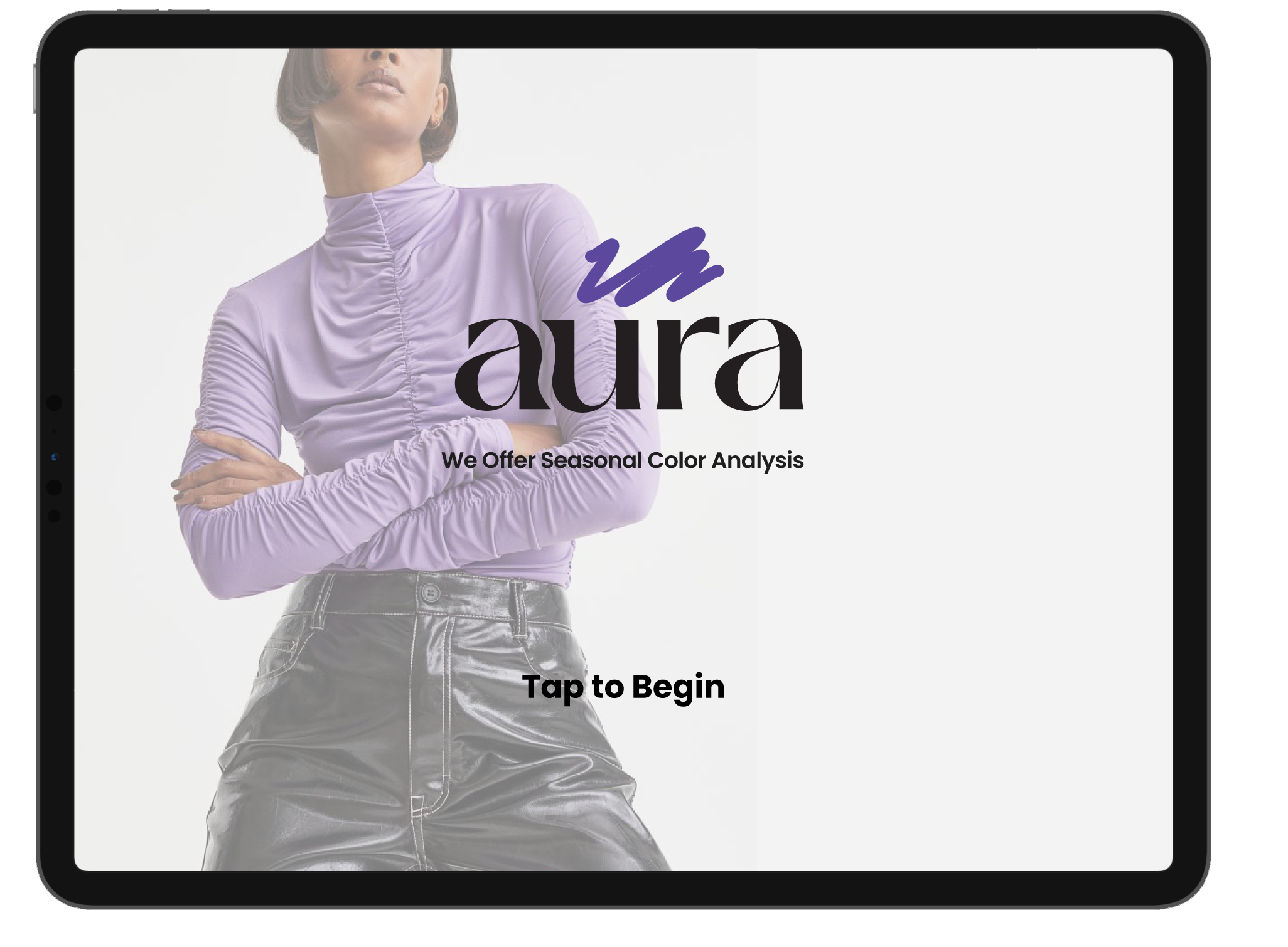
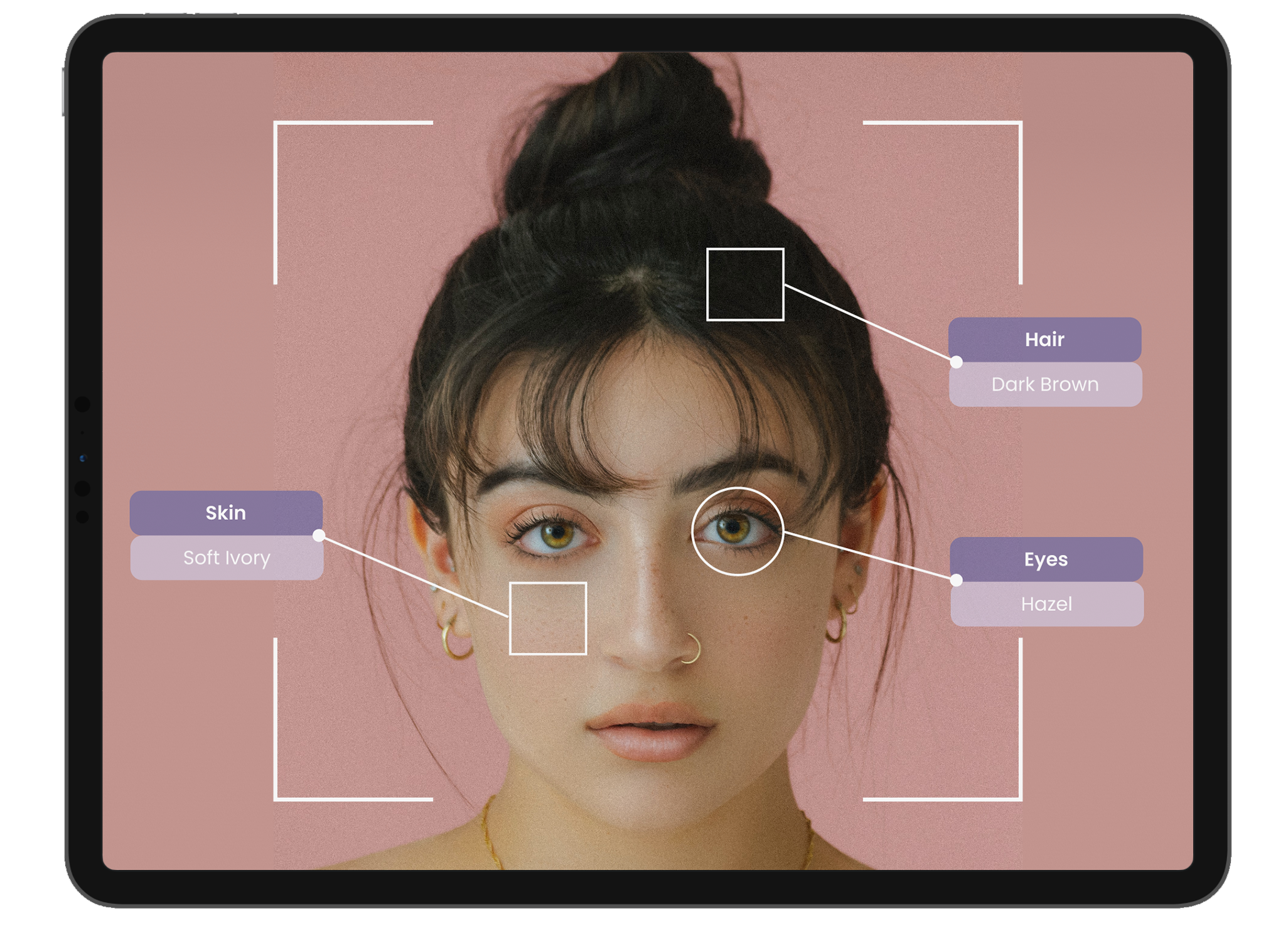
Our team wanted to develop a Kisok app providing a unique, interactive, personalized, and time-efficient way to shop with a seasonal color analysis, online order pick ups, and reserve items. Users will have the ability to customize their shopping experience to best fit their personal style and color palette. We will provide the ability to reserve items to try on free of any commitment. Our app will show users recommendations tailored to them with the ability to save for later.
Goal Directed Design
Goal-Directed Design is a process of design that was created by Alan Cooper. Unlike other design processes, Goal-Directed Design focuses on the needs of the user. Following the steps in the design process, my team and I were able to create a successful prototype for an app.
The steps to this design process are:
1. Research
2. Modeling
3. Requirements
4. Framework
5. Refinement
6. Support
User Testing
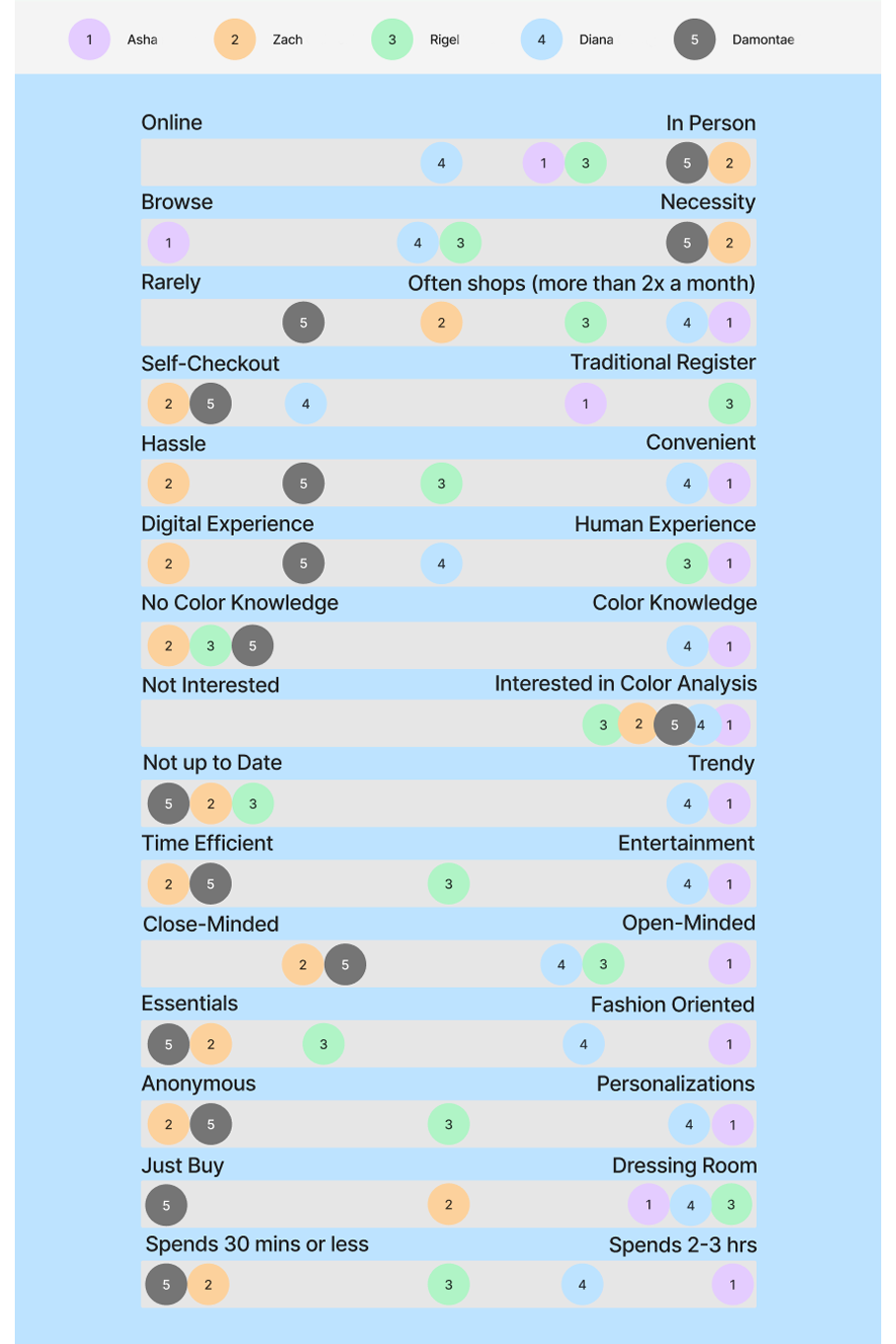
Once we completed our preliminary research, our team set out to find users to interview. We interviewed five different subjects with varying needs and skills. Below is a Behavior Variable Continuum based on our findings from the user interviews.
Wireframing
Low Fidelity Wireframe
As a group, we discussed some design basics before we began wire-framing. We then each took on pages that we wanted to create for our low fidelith wireframe.

High Fidelity Wireframe
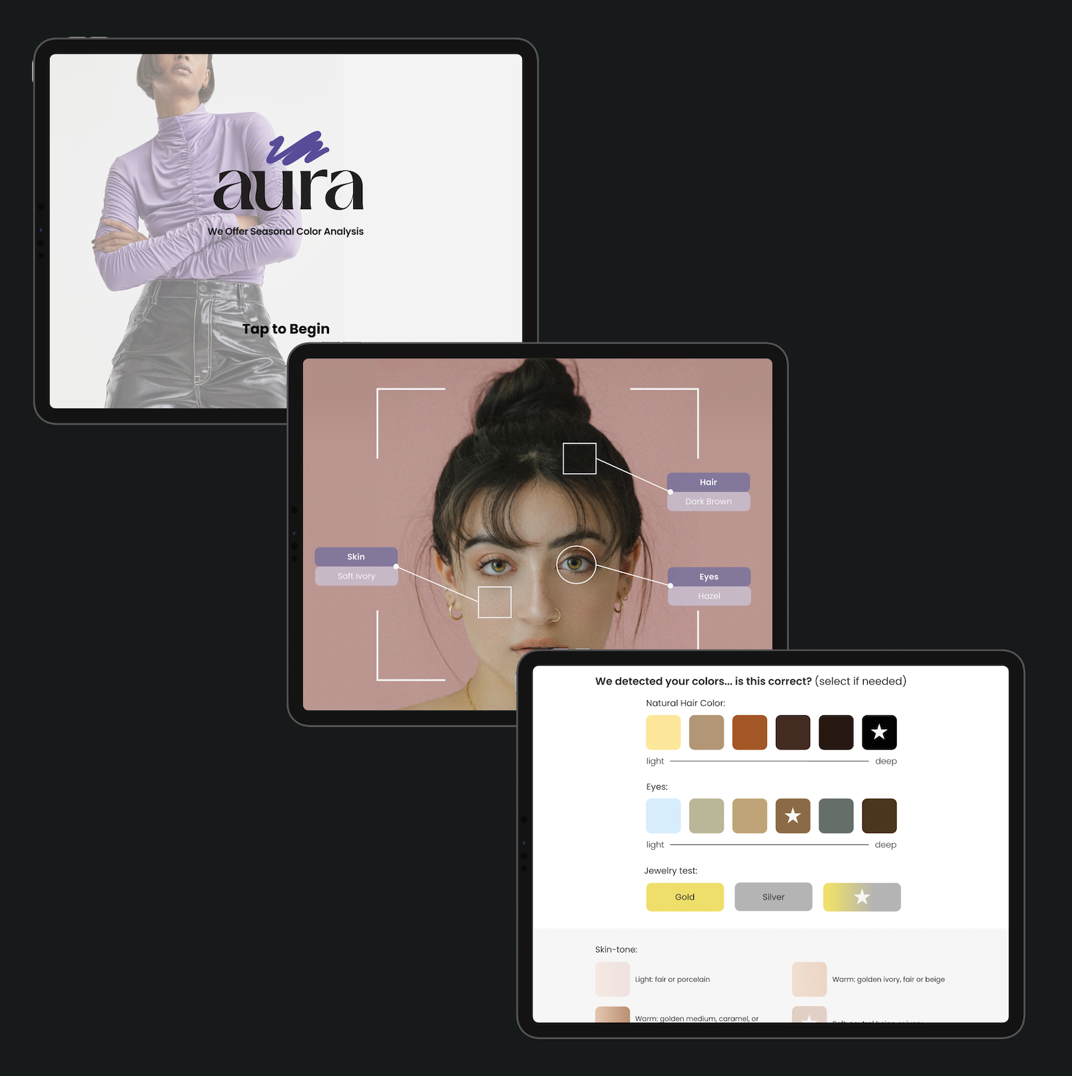
With our layout complete, we began designing our high-fidelity in Figma. Our team wanted to keep our design simple to avoid overwhelming the user. We also decided to design with a modern and clean aesthetic along with pops of color.

Style Guide
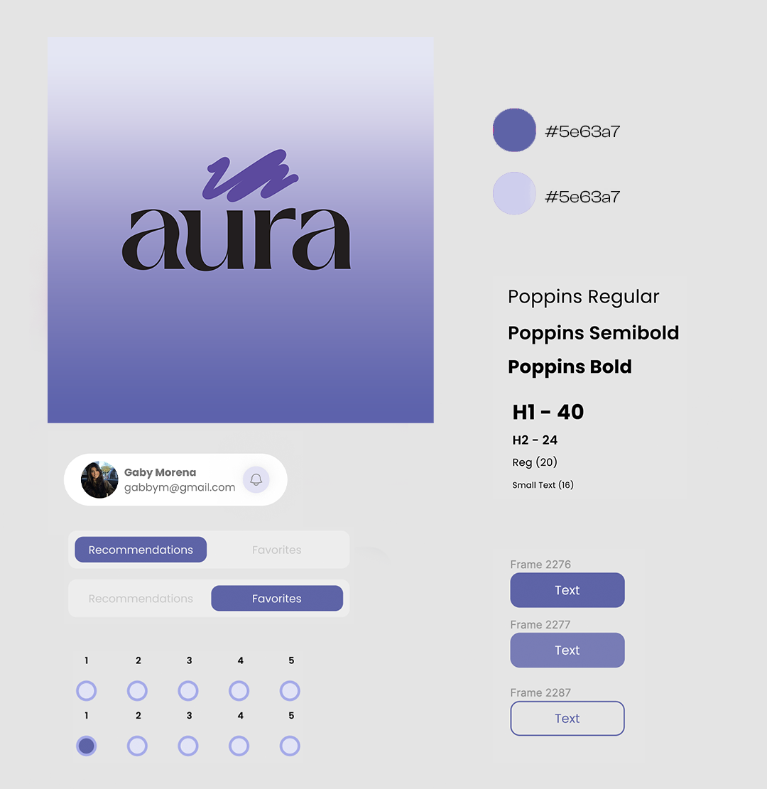
Our team wanted our app to have a modern feeling while also looking clean. We decided to choose two accent colors to compliment our logo and use throughout the site. Our primary colors were shades of purple. We thought having a light background would add to the modern feeling while also adding contrast. In order to simplify our design we only selected one font, Poppins. We decided on button styles and sizing for different features. Our team also finalized our icon selection.
Final Product
Finally, our prototype was done after a few design changes and it was time for us to get some feedback. We conducted user testing with seven people. Overall we got back great feedback. We then took this feedback and incorporated it when we went back to make edits to the initial prototype. WIth our edits, we determined that our app was usable through calculating all of our user's System Usability Scale forms.
Final Thoughts
After three months of hard work, we finished our project after a few last-minute edits. This project was a favorite to work on and I am proud of how it turned it. This project allowed me to fine tune preexisting skills while also forcing me to challenge myself and take on new skills. I am now more confident in my Figmq skills and became designed for a new interface. Please contact me with any questions using the information provided.


